As a longtime user of both Google Slides and PowerPoint, there are some key features in Microsoft’s presentation software that I really wish Google would add to Slides.
Wipe Animation – This is the one I miss the most! I used this animation extensively when I taught physics because vectors, diagrams, and graphs are a core part of the subject. With the wipe animation in PowerPoint, you can make objects look like they are being drawn on the screen. This creates a fluid, natural motion like you’re illustrating on a whiteboard. It allowed me to break down concepts step-by-step, revealing each part of a diagram or graph sequentially.

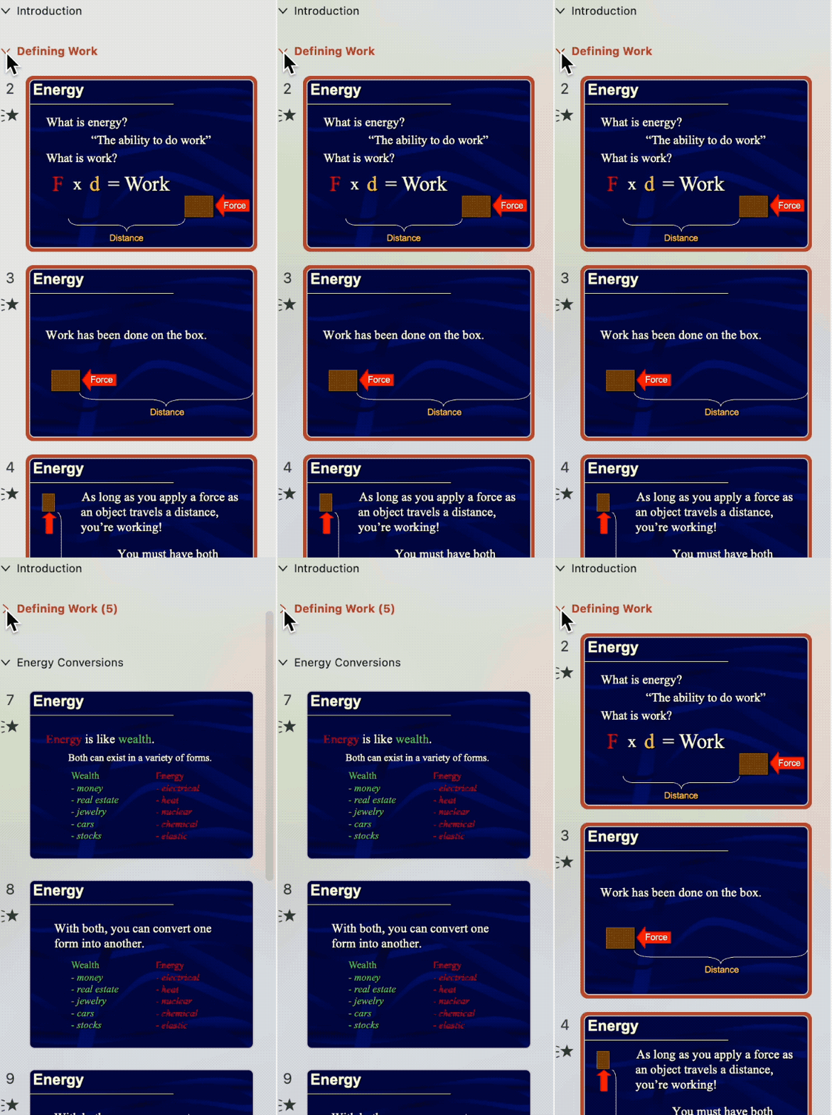
Add Sections – Another useful feature in PowerPoint that I wish Google Slides would adopt is the ability to divide a presentation into sections. PowerPoint allows you to break up your slides into logical subgroups by using the Add Section option. This provides a clear visual outline of your presentation flow. You can collapse and expand the sections to get a high-level view or quickly navigate to a particular part. The section feature helps organize complex presentations with many slides. Without sections, long presentations in Google Slides just turn into an endless grid of thumbnails that are difficult to manage. The section functionality is a real time-saver and keeps things tidy even in lengthy presentations.

Timing Controls – PowerPoint also provides superior timing controls over Google Slides. In Slides, you can only adjust the animation and transition duration using a slider, making it hard to precisely review or enter times.

PowerPoint lets you directly type in a custom duration and even add delays before animations and transitions begin. Another limitation in Slides is the maximum 5 second duration for animations and transitions. PowerPoint has no limits – you can add any duration. This is helpful for creating countdown timers that can run for minutes while your audience is completing an activity. Google Slides unfortunately lags behind in enabling such fine-tuned timing editing and flexibility.

While Google Slides offers simplicity, I think its shortcomings have limited our presentations. Without the robust controls and capabilities present in PowerPoint, more and more Google Slides presentations are becoming static pages that deprive presenters the opportunity to ease an audience toward an idea or to tell a story. I hope Google Slides adds more presentation-centric features soon. If it doesn’t, our Google Slides are slipping closer and closer to resembling PDFs.

 RSS - Posts
Recent Comments